Advanced data integration, data operations, and data visualization improvements
We have exciting product updates that help you more efficiently manage, visualize, and share your data. Here’s an overview of what’s new in Toric:
New data visualization sharing capabilities
It’s essential to have security, governance, and control over how your data visualizations are shared. We’ve added new configuration options when it comes to sharing your dashboards and reports in Toric.
Users now have the ability to share their data visualizations securely by:
Adding a password
Creating a secure password when sharing a data visualization in Toric adds an additional layer of protection. Anyone accessing your data visualization with your sharing link will need to use the password you set.
Setting expiration dates
Grant temporary access to a data visualization in Toric. Set sharing links to expire using our preset options, including:
- 24 hours
- 48 hours
- 72 hours
- Or a week.
The link you share will only be accessible for the selected period of time. This makes it easier for you to control how long an end user has access to your data visualizations.
Data operations improvements to no coding nodes
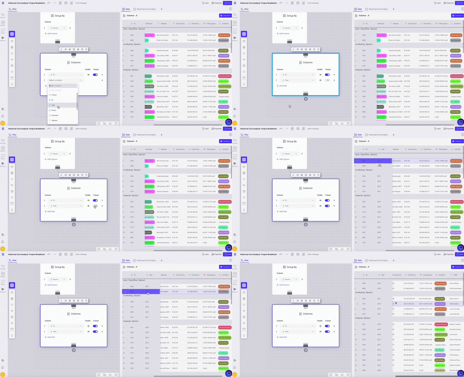
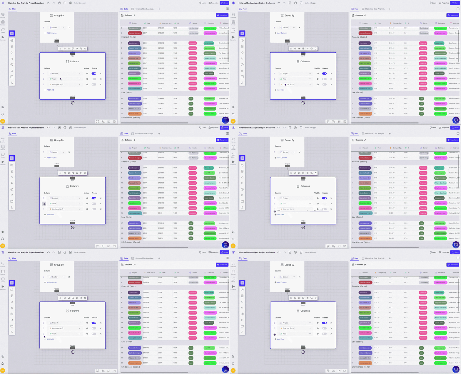
We’ve made changes to our columns node that improve how it functions. With these changes, you now have the ability to do three things with your columns:
Control visibility. Choose whether you want a column visible by turning it off or on. If you disable visibility of a column, it still exists in that table - this only controls column visibility when you’re visualizing a table.

Freeze column. Visually isolate specific columns when scrolling in a data table. Toggle on the column within the node that you would like to freeze, and this column will now become a static column. You can also freeze multiple columns at once to suit your needs when working in a data table.

Reorder columns. Within the columns node, drag the columns in the order you would like them to appear in your table. This reorder will be reflected in your data visualization.

Data visualization enhancements to legends in charts
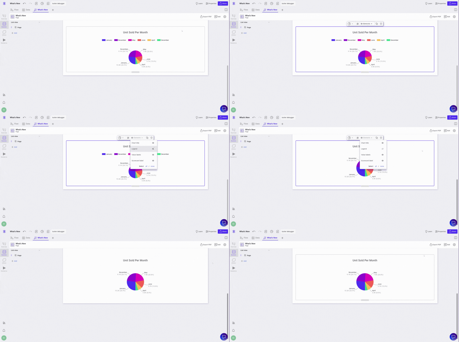
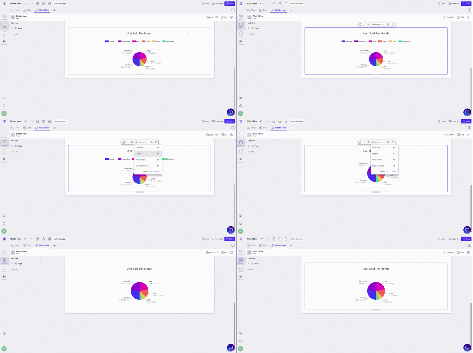
Using legends within charts can be a simple tool for providing the information needed to make your dashboards or reports easier to understand. We’ve added new ways to customize legends within charts:
Manage visibility easily. Control which elements are shown within your chart using the visibility toggle. You can manage visibility by clicking into your chart and navigating to the Elements dropdown.

Control legend formatting. Customize key formatting like placement, bullet styles, and overflow settings. Legend placement determines where your legend displays in relation to the chart. Bullet style defines the shape of the color key within your legend. Overflow determines how your legend displays when the information overflows from the display frame.
Customize dropdown coloring in data visualizations
This feature allows you to further control the visual elements of your dashboards and reports. You can now add (or remove color) from the dropdown items in your data visualizations. Within the dropdown’s property settings, navigate to Format. In the Dropdown tab, you’ll now see an option to toggle colors on or off.
Login now or sign up for free
Give out new features a try for yourself by logging in or singing up for a free account. Not sure where to start? Book a demo to walk through how Toric can be used for your specific needs.


.png)


.png)


